9 Print and Pattern Fashion Mistakes That Age You
Walking into your closet and feeling like your clothes are working against you is a frustrating experience many women face as they refine their style. Prints and patterns are often the culprits, as they have the power to either brighten your complexion or make you look decades older than you feel.
Modern fashion is less about following rigid rules and more about understanding how scale, color, and contrast interact with your natural features. Choosing the wrong motif can visually weigh you down, creating a dated silhouette that hides your personality instead of highlighting it.
This guide breaks down the nine most common pattern pitfalls that can age your appearance and provides the specific shifts you need to make to keep your wardrobe fresh. By adjusting your approach to these classic designs, you will create a more expensive-looking, vibrant aesthetic that feels timeless rather than tired.
1. The Overpowering Oversized Floral
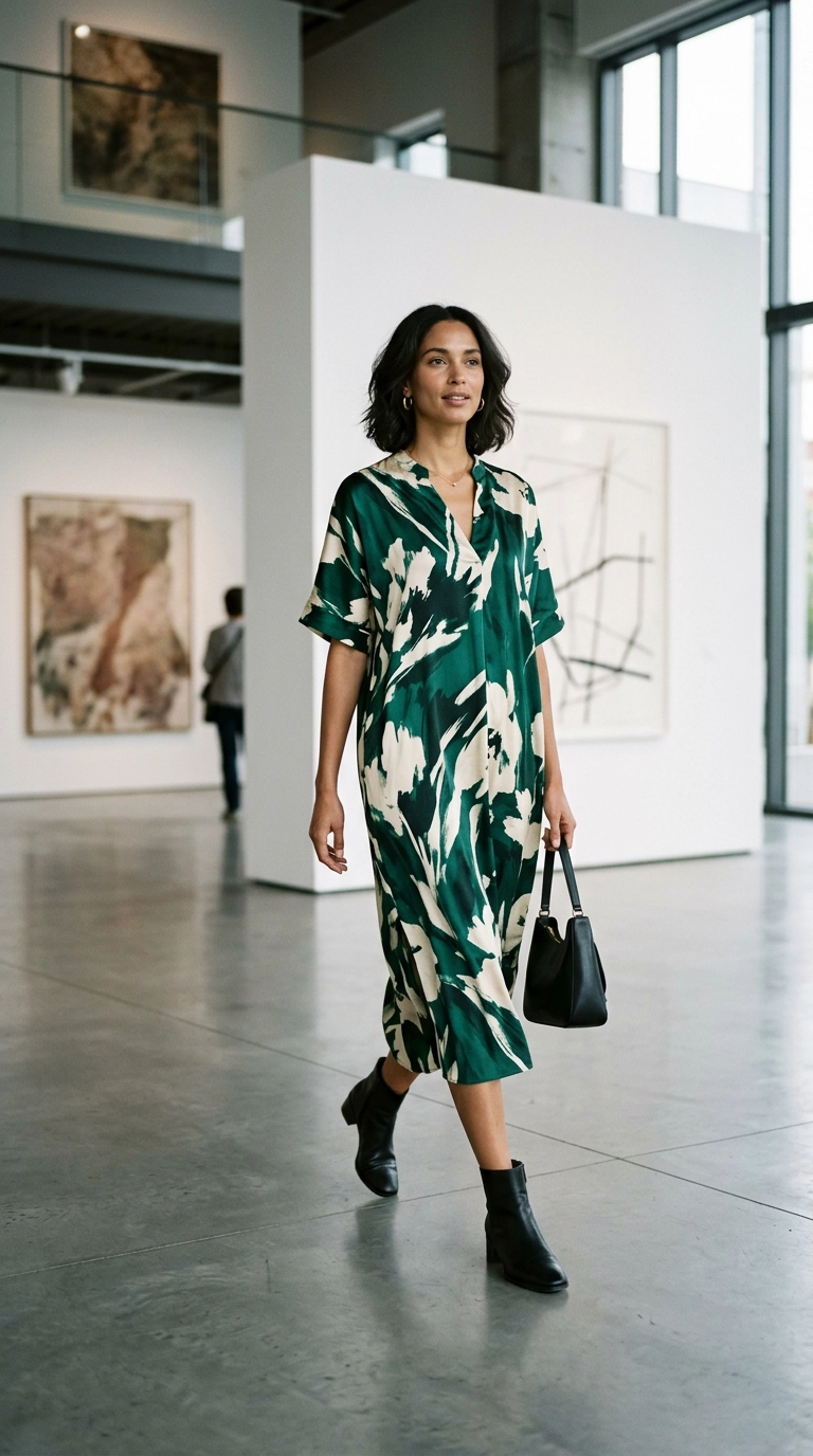
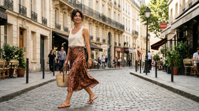
Large, literal floral prints in muted shades often lean toward “upholstery” territory, which can instantly age a look. When the flowers look too realistic and are spaced out on a dark background, they create a heavy visual weight that lacks modern energy.
To fix this, look for abstract florals or those with a “blurred” effect that feels more like a painting than a photograph. Choosing a smaller scale or a more vibrant, unexpected color palette helps the print feel intentional and high-fashion rather than something from a dusty department store.
Consider these modern floral alternatives:
- Ditsy prints with significant “negative space” between the flowers.
- Monochromatic floral patterns that rely on texture rather than high color contrast.
- Graphic, stylized blooms that feel architectural and clean.
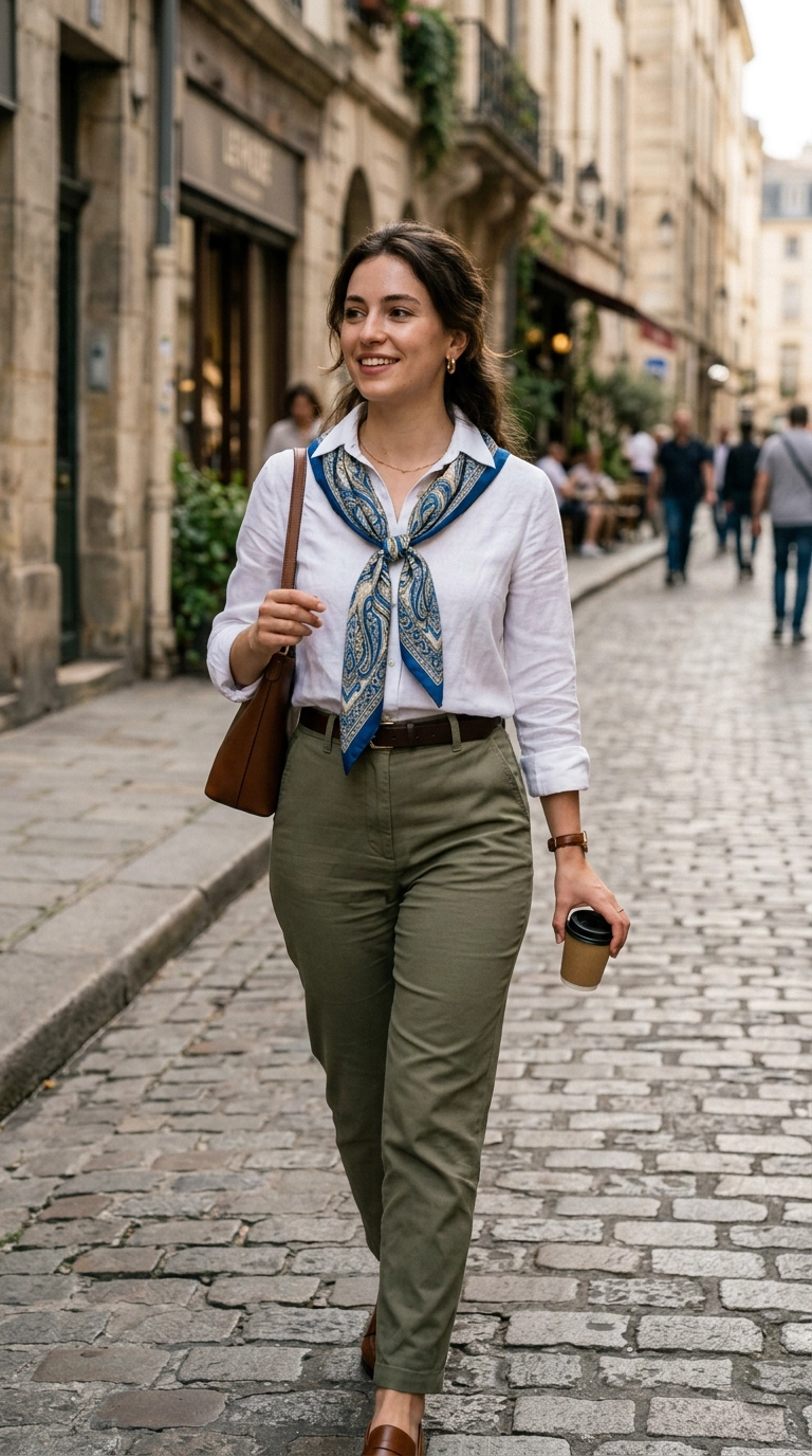
2. Muddy and Muted Paisley Designs
Paisley is a classic, but when it features murky browns, maroons, and olives, it can look incredibly dated. These color combinations tend to wash out the skin and evoke a 1970s aesthetic that doesn’t always translate well to a contemporary professional wardrobe.
If you love the intricate nature of paisley, opt for versions that feature a clean white or cream base with one or two vibrant accent colors. This creates a crispness that looks much more youthful and polished, especially when paired with modern basics like denim or leather.
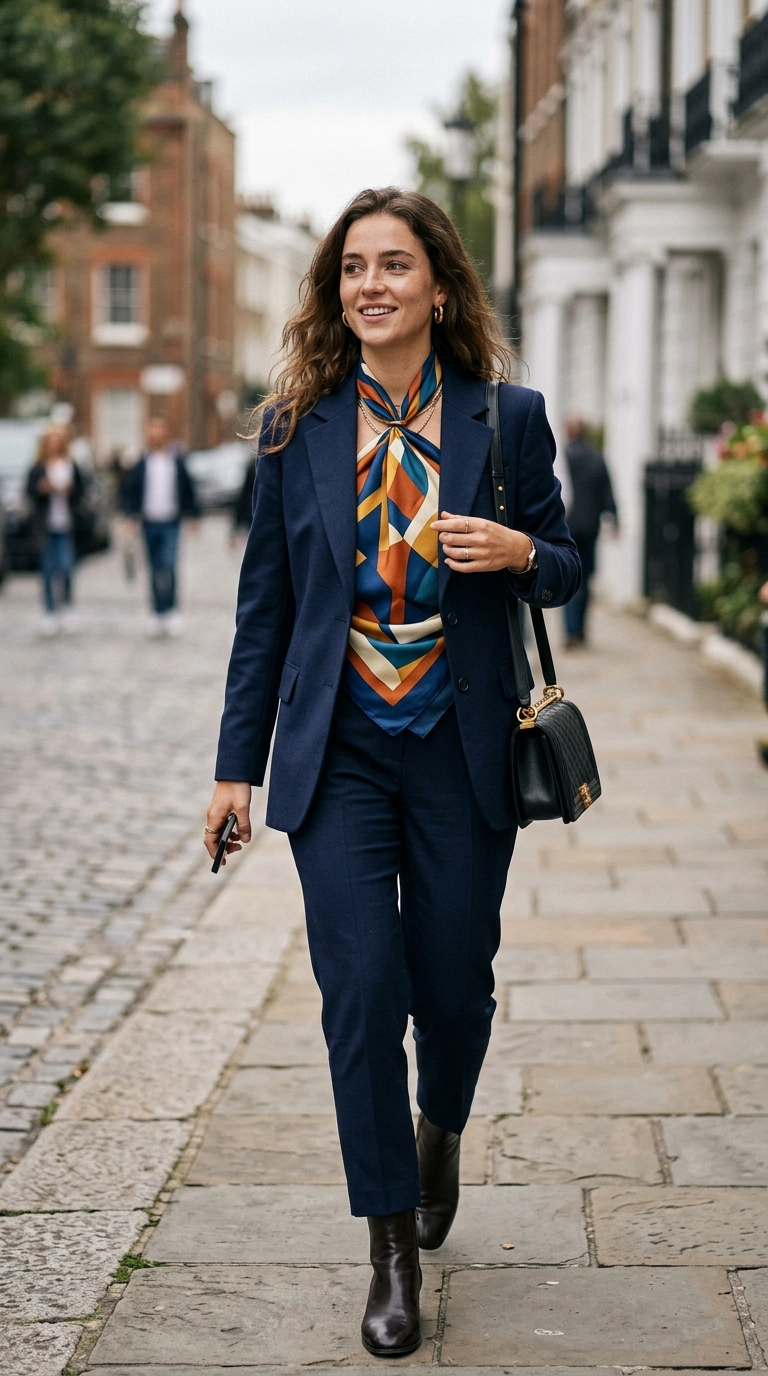
Keeping the paisley limited to an accessory, like a high-quality silk scarf or a handbag lining, is another way to enjoy the print without it overwhelming your frame. Focus on clarity in the print’s lines to ensure the detail looks expensive and sharp.
3. High-Contrast Horizontal Stripes
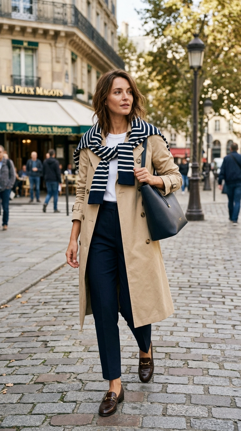
While the Breton stripe is a staple, wide and high-contrast horizontal stripes can create an optical illusion that widens the torso and pulls the eye downward. This can result in a slumped appearance that lacks the verticality associated with a youthful, energetic silhouette.
To modernize your stripes, experiment with varying widths or pinstripes that offer a more subtle texture to the fabric. Vertical or diagonal stripes are much more effective at elongating the body and creating a streamlined look that feels current and sophisticated.
If you stick with horizontal stripes, ensure the garment is perfectly tailored to avoid any sagging or bunching at the waist. Pairing a striped top with a high-waisted, solid-colored trouser helps ground the pattern and keeps the focus on your shape.
4. The Head-to-Toe Animal Print Trap
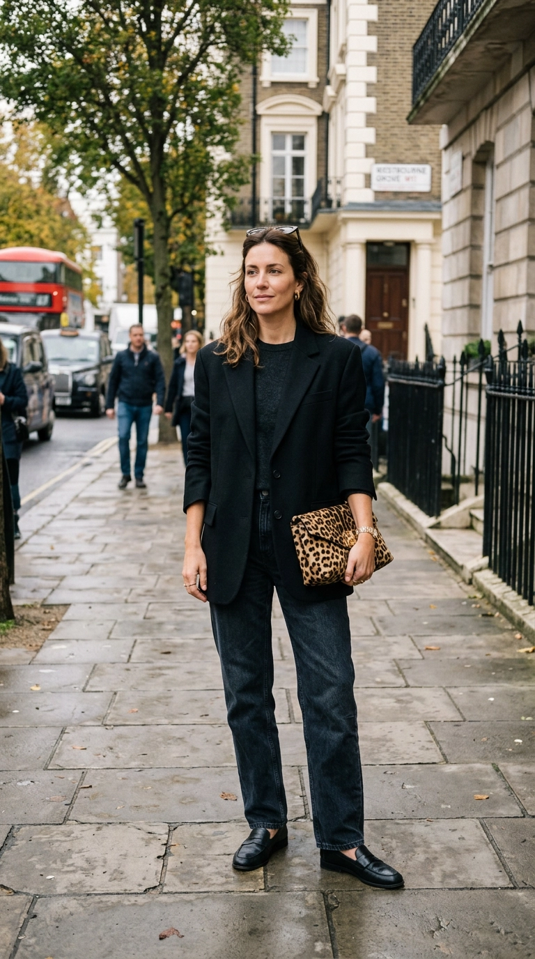
Animal prints like leopard or zebra can be incredibly chic, but wearing them in large, unstructured volumes can quickly look “costumey.” When a leopard print dress is too loose or made from cheap, shiny synthetic fabric, it loses its luxury appeal and can look tacky.
The secret to wearing animal print at any age is treating it as a neutral rather than a statement. Use it in small doses—a pair of pointed-toe flats, a belt, or a structured handbag—to add a touch of rebellion to a classic outfit.
When choosing a larger piece, like a coat or a skirt, look for prints that use natural, earthy tones rather than high-contrast yellows or oranges. High-quality fabrics like silk, wool, or calf-hair will make the pattern look sophisticated and intentional.
5. Tight and Regular Polka Dots
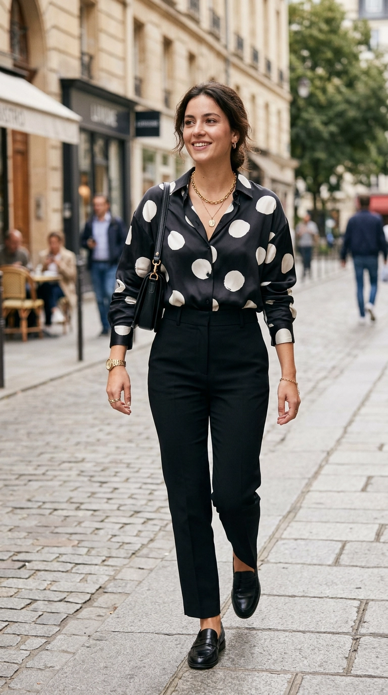
Small, perfectly symmetrical polka dots often have a “schoolgirl” or “vintage housewife” feel that can look out of place on a mature woman. This rigid pattern lacks movement and can make an outfit feel stiff and overly conservative.
Switch to irregular “pebble” dots or larger, more artistic circles to give the print a modern, avant-garde edge. These variations feel more like an intentional design choice and less like a standard fabric found in a craft store.
Choosing polka dots in non-traditional colors, such as navy on cream or tan on white, also helps soften the look. This reduced contrast is much more flattering against the skin and allows your natural features to take center stage.
6. Dated Pastel Plaids
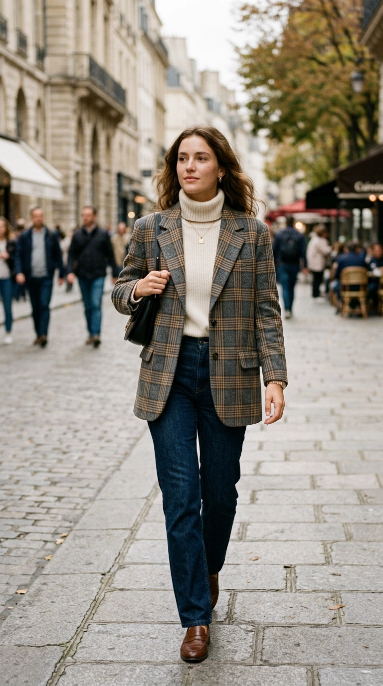
Plaid is often associated with heritage and prep, but pastel-colored plaids in flimsy fabrics can look like children’s sleepwear or dated Easter attire. These light, multi-colored grids lack the structure needed to create a polished, expensive-looking outfit.
Opt for heritage checks like Prince of Wales, houndstooth, or Glen plaid in neutral tones such as charcoal, camel, and black. These patterns convey a sense of authority and timelessness that works beautifully in blazers, coats, and trousers.
Ensure the scale of the plaid is proportionate to your height; smaller checks usually work better for petite frames, while larger windows of color can be carried by taller silhouettes. Pairing these structured prints with soft textures like cashmere creates a beautiful, balanced contrast.
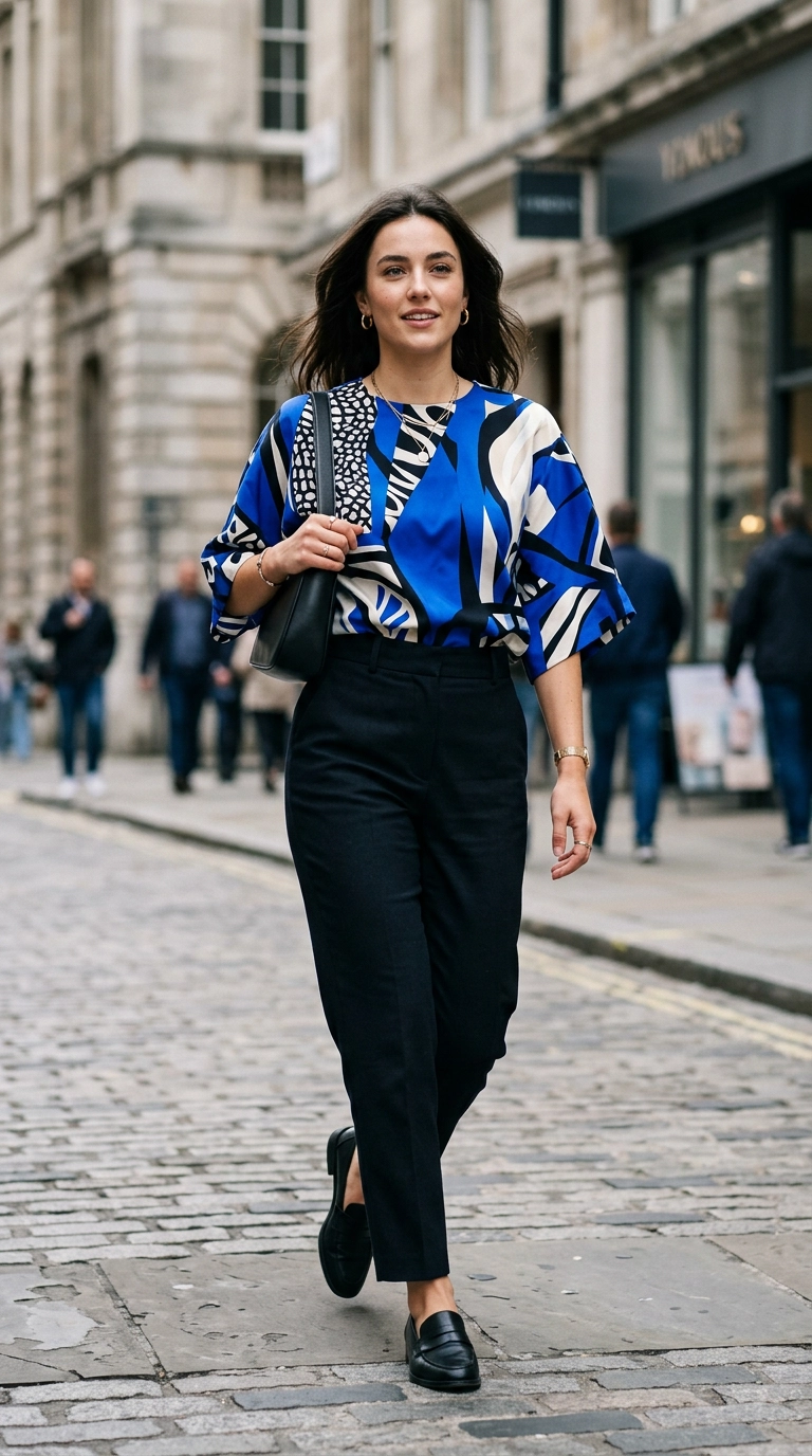
7. Chaotic Geometric Overload
Busy, kaleidoscope-style geometric prints can be physically exhausting for the eye to look at. When a pattern is too “noisy,” it distracts from the person wearing it, often making the wearer look frazzled or dated.
Modern geometrics should feel clean and architectural, utilizing negative space to give the eye a place to rest. Look for simple shapes—triangles, circles, or clean lines—in a limited color palette of two or three shades.
If you do choose a bold geometric piece, keep the rest of your outfit extremely simple. A geometric skirt paired with a crisp, solid-colored button-down shirt ensures the look is editorial rather than overwhelming.
8. Matching Sets Without Structure
The “pyjama trend” is popular, but matching pattern sets that lack tailoring can look like you’ve forgotten to get dressed. Without a defined waist or structured shoulders, a full-body pattern can hide your shape and make you look older by creating a saggy silhouette.
When wearing a matching set, the fabric quality is the most important factor. Heavier linens, structured cottons, or thick silks hold their shape and signal that the look is intentional high-fashion.
You can also “break” the pattern by adding a solid-colored belt or a structured blazer in a coordinating neutral tone. This adds the necessary visual breaks that help the eye navigate your outfit and appreciate the pattern without being drowned by it.
9. Neon Prints on Dark Backgrounds
High-saturation neon colors printed on a black or navy base often scream “early 2000s” in a way that isn’t flattering. The harsh contrast between the dark background and the neon print can emphasize shadows on the face and highlight fine lines.
Instead, look for vibrant colors printed on light neutrals like sand, cream, or light grey. This “low-contrast” approach is much more illuminating for the skin and gives the outfit a sophisticated, breezy feel that looks much more expensive.
If you enjoy bright colors, try a solid-colored piece in that shade rather than a print. A single pop of a vibrant hue is often more modern and youthful than a busy, dated pattern in the same color scheme.
Modern Pattern Selection Guide
| Pattern Type | Dated Choice (Age-Advancing) | Modern Choice (Youth-Enhancing) |
|---|---|---|
| Floral | Muted, literal, dense blooms | Abstract, airy, artistic watercolor |
| Stripes | Wide, high-contrast horizontal | Vertical pinstripes or varying widths |
| Animal | All-over shiny synthetic leopard | Textured accessories or neutral tones |
| Checks | Multi-colored pastel plaid | Heritage houndstooth or Glen plaid |
| Geometrics | Busy kaleidoscope styles | Clean, architectural shapes with space |
Frequently Asked Questions
How can I tell if a print is too big for me?
Hold the fabric up to your body in front of a full-length mirror. If the pattern is the first thing you see and your face gets “lost” in the design, the scale is likely too large for your frame.
Can I mix different patterns in one outfit?
Yes, but keep them in the same color family to maintain cohesion. Mixing a large-scale print with a tiny, subtle pattern usually provides enough contrast without looking chaotic or dated.
What is the most “anti-aging” pattern?
Subtle, tonal prints like a light-on-light pinstripe or a tonal animal print are generally the most flattering. They provide visual interest and texture without drawing harsh lines across your silhouette.
Mastering prints is all about finding the balance between tradition and trend. By avoiding heavy, muddy designs and embracing prints with clarity, space, and structure, you can ensure your wardrobe feels as vibrant and modern as you are. Remember that the best pattern is the one that makes you feel confident and allows your natural personality to shine through.