5 Spring Floral Fashion Mistakes That Look Super Dated
Your spring wardrobe deserves more than the same tired patterns you have been wearing since 2015. Florals are a seasonal staple, but certain iterations now scream dated rather than darling.
We are moving away from the predictable and toward high-impact, curated botanical looks that command respect in any room. It is time to audit your closet and identify the pieces holding back your style evolution.
Follow this guide to spot the five major floral mistakes that are aging your aesthetic. You will learn exactly how to swap them for modern alternatives that feel fresh, expensive, and intentional.
The Overcrowded Ditsy Print on Stiff Fabrics
Small, repetitive floral patterns known as ditsy prints often lean too far into youthful or domestic territory. When these tiny flowers appear on rigid cotton or cheap polyester, the garment can easily resemble vintage kitchen curtains or children’s pajamas.
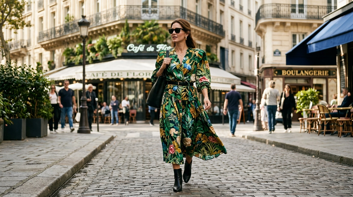
Modern fashion favors breathing room between motifs. High-end designers are opting for larger, more painterly botanical illustrations that allow the background fabric to participate in the design.
The Problem With Scale
Tiny prints lack a clear focal point, which causes the eye to glaze over. This creates a cluttered appearance that hides your silhouette instead of highlighting your style sensibility.
Choose prints where the individual flowers are at least the size of your palm. This shift in scale immediately elevates the garment from a basic mall find to a runway-inspired piece.
Focus on Fabric Fluidity
Stiff fabrics paired with small prints create a boxy, dated look. To fix this, look for ditsy prints only on high-quality silks, satins, or gauzy linens that move with your body.
A fluid fabric breaks up the repetition of the print as you walk. This movement prevents the pattern from looking static and flat against your frame.
| Dated Feature | Modern Alternative |
|---|---|
| Small, crowded ditsy prints | Oversized, spaced-out botanicals |
| Stiff, heavy cotton blends | Fluid silks and draped linens |
| High-contrast primary colors | Tonal or moody color palettes |
The “Total Look” Floral Matching Set

There was a brief window where wearing a matching floral top, bottom, and headband was considered a trend. Today, this approach feels overly considered and lacks the effortless vibe required for Tier 1 style.
Head-to-toe florals in the same print can overwhelm your features. Instead of people seeing you, they only see a vibrating mass of pattern and color.
The Power of Solid Anchors
To fix this, break up your floral pieces with solid anchors. If you have a beautiful floral skirt, pair it with a crisp white button-down or a structured black bodysuit.
A solid color provides a “resting place” for the eyes. It allows the floral print to act as the statement piece rather than the entire personality of the outfit.
Mixing Textures Instead of Prints
Instead of matching prints, try matching colors while varying the textures. A floral silk blouse looks incredible when tucked into leather trousers of the same base hue.
This creates visual interest through depth and light reflection. It shows a higher level of sartorial intelligence than simply buying a pre-packaged set from a retail store.
Literal Garden Party Styling Without Contrast
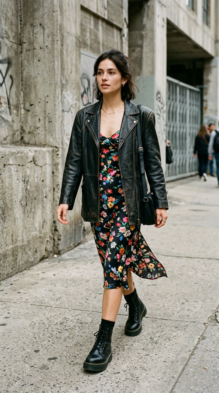
Styling a floral dress with pearls, a sun hat, and delicate ballet flats is a recipe for looking like a period piece character. While classic, this literal interpretation of “spring” lacks the edge needed for a contemporary look.
The secret to modern florals lies in the juxtaposition of soft and hard elements. You want to subvert the sweetness of the print with something unexpected.
The Masculine-Feminine Balance
Pair your most feminine floral midi dress with an oversized, masculine blazer or a rugged denim jacket. This contrast creates a dynamic silhouette that feels current and intentional.
Footwear also plays a massive role in grounding the look. Swap the dainty sandals for a sleek pointed-toe boot or a heavy-sole loafer to add weight to the outfit.
Hardware and Accessories
Avoid jewelry that feels too precious when wearing florals. Dainty floral earrings or necklaces with flower charms can make the look feel costume-y.
Opt for bold gold hoops, chunky chain necklaces, or architectural silver pieces. These modern metal finishes provide a sharp contrast to the organic shapes in your clothing.
Oversaturated Neons and Synthetic Palettes
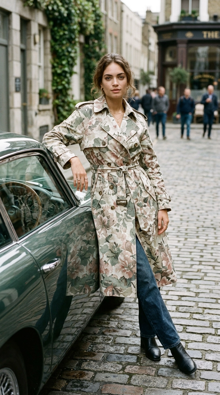
Bright neon pinks and electric blues in a floral print are often a sign of fast fashion. These oversaturated colors tend to look harsh under natural spring sunlight and can wash out many skin tones.
The most expensive-looking florals are those that mimic the colors found in actual nature. Think of dried roses, mossy greens, and deep earth tones rather than highlighter shades.
Embracing Muted and Desaturated Tones
Search for prints that use a sophisticated palette of sage, terracotta, dusty lilac, and cream. These colors blend harmoniously and look far more high-end than their neon counterparts.
Muted tones also make the garment more versatile. A sage-green floral dress can transition from a morning meeting to an evening gallery opening with ease.
The Importance of Print Depth
Avoid prints that look like they were flat-stamped onto the fabric with no shading. High-quality prints feature depth, layers, and varying levels of transparency.
When a print has depth, it looks like a work of art rather than a digital graphic. This subtle detail is what separates a luxury garment from a budget alternative.
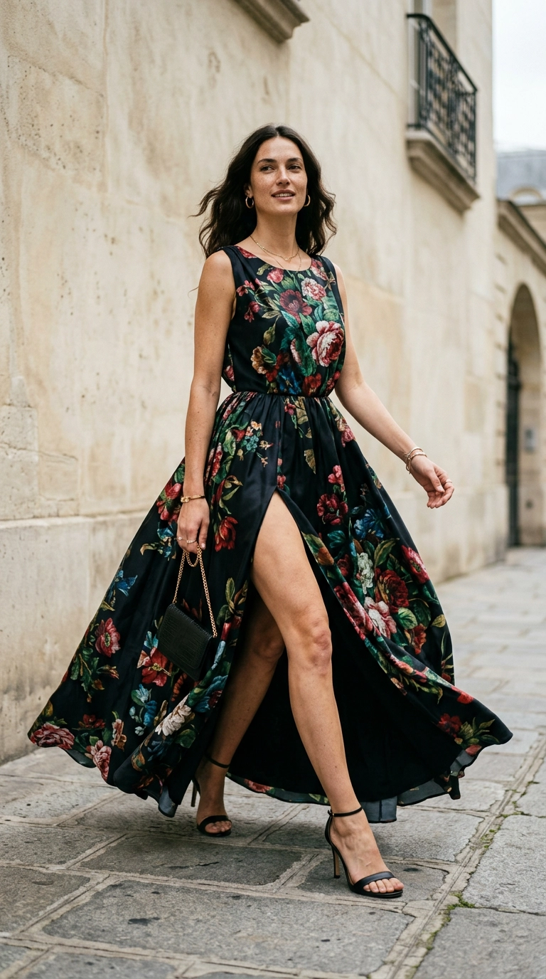
The “Safe” A-Line Knee-Length Silhouette
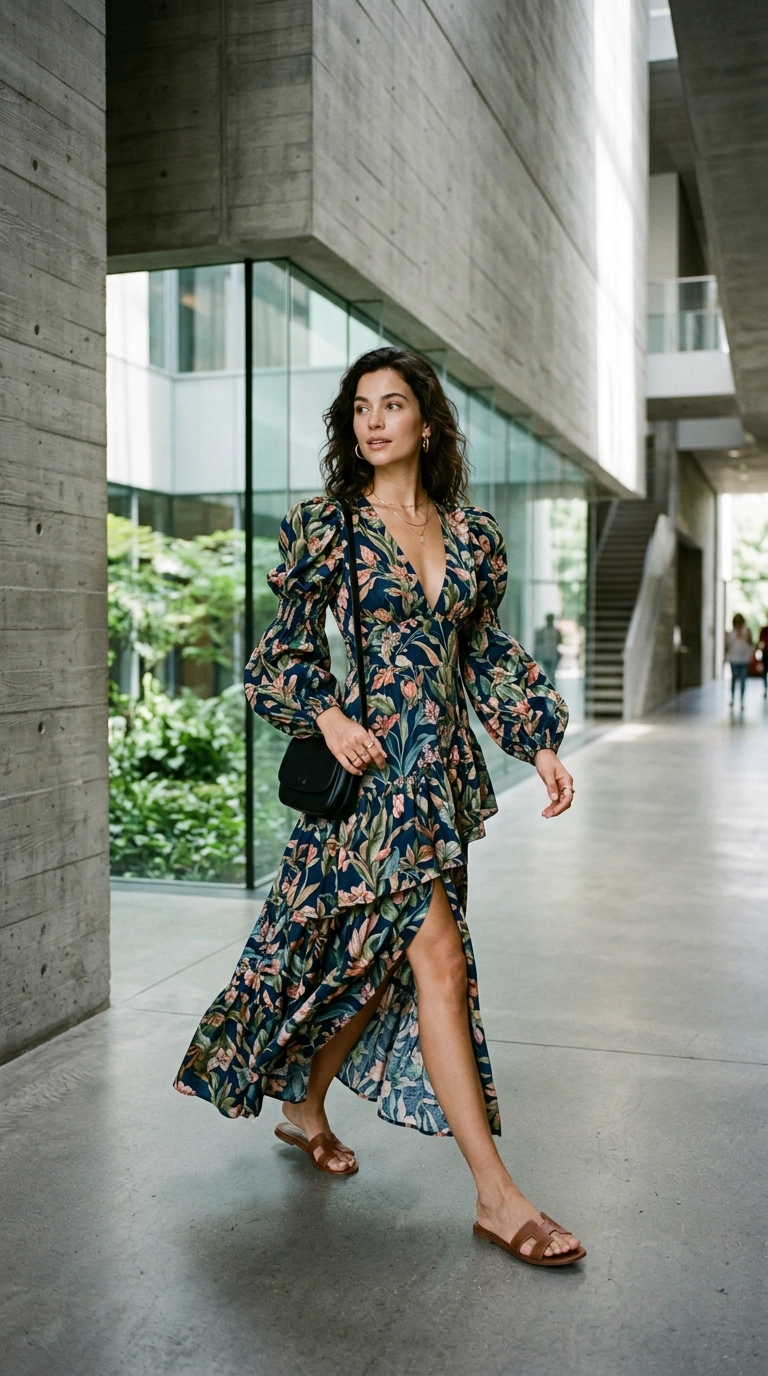
The standard A-line, knee-length floral skirt is perhaps the most “mumsy” silhouette in existence. It is a safe choice that often results in a dated, uninspired aesthetic that lacks confidence.
To modernize your look, you must experiment with more daring and architectural silhouettes. This moves the focus from the “pretty” print to the sophisticated shape of the garment.
Try Asymmetry and Cut-Outs
Look for floral dresses with asymmetrical hemlines, unexpected cut-outs at the waist, or one-shoulder necklines. These details add a level of complexity that feels very current.
An asymmetrical hem allows the floral fabric to catch the air and move beautifully. It breaks up the traditional horizontal lines that can sometimes truncate your height.
The Rise of the Floral Suit
If you want to wear florals in a professional setting, skip the skirt and choose a structured suit. A floral blazer with matching tailored trousers is a power move when executed correctly.
The sharp lines of a blazer counteract the softness of the floral print. It creates a look that is both authoritative and stylish, proving that florals can be serious business.
Key Silhouette Swaps
- Replace knee-length A-line skirts with floor-sweeping maxi lengths or thigh-high slits.
- Swap cap sleeves for dramatic puff shoulders or sleek sleeveless designs.
- Exchange high, round necklines for deep V-necks or square architectural necklines.
- Ditch elastic waistbands for structured belts or corseted bodices.
Mastering spring florals is about more than just picking a pattern you like. It requires an eye for scale, a commitment to quality fabrics, and a willingness to challenge traditional styling norms. By avoiding these five dated mistakes, you ensure your style remains elevated and relevant throughout the season. Focus on contrast, embrace sophisticated palettes, and always prioritize a modern silhouette over a safe one to truly stand out.