10 Color Clashing Fashion Mistakes to Avoid in Daily Wear
Staring at a closet full of vibrant pieces only to settle for a beige trench coat is a symptom of color-clashing anxiety. Most style enthusiasts want to break away from neutrals but fear looking like a chaotic visual afterthought rather than a curated trendsetter.
Mastering the friction between opposing hues is the secret language of high-fashion editors. It is not about matching; it is about creating a deliberate tension that feels sophisticated and intentional.
We have pinpointed the specific mistakes that drain the luxury out of your daily outfits. By correcting these ten errors, you will move from accidental clashing to high-impact styling that commands respect in any Tier 1 city.
1. The Fatal 50/50 Proportion Split
When you wear two clashing colors in equal amounts, you create a visual “halving” effect that confuses the eye. This mistake makes the body look shorter and the outfit look like a sports uniform rather than a fashion statement.
Instead, follow the 70/30 rule. Choose one dominant color to take up the majority of your silhouette and use the clashing hue for your second piece or large accessories.
This creates a clear visual hierarchy. It tells the observer exactly where to look first, which is the hallmark of professional styling.
2. Neglecting the Undertone Harmony
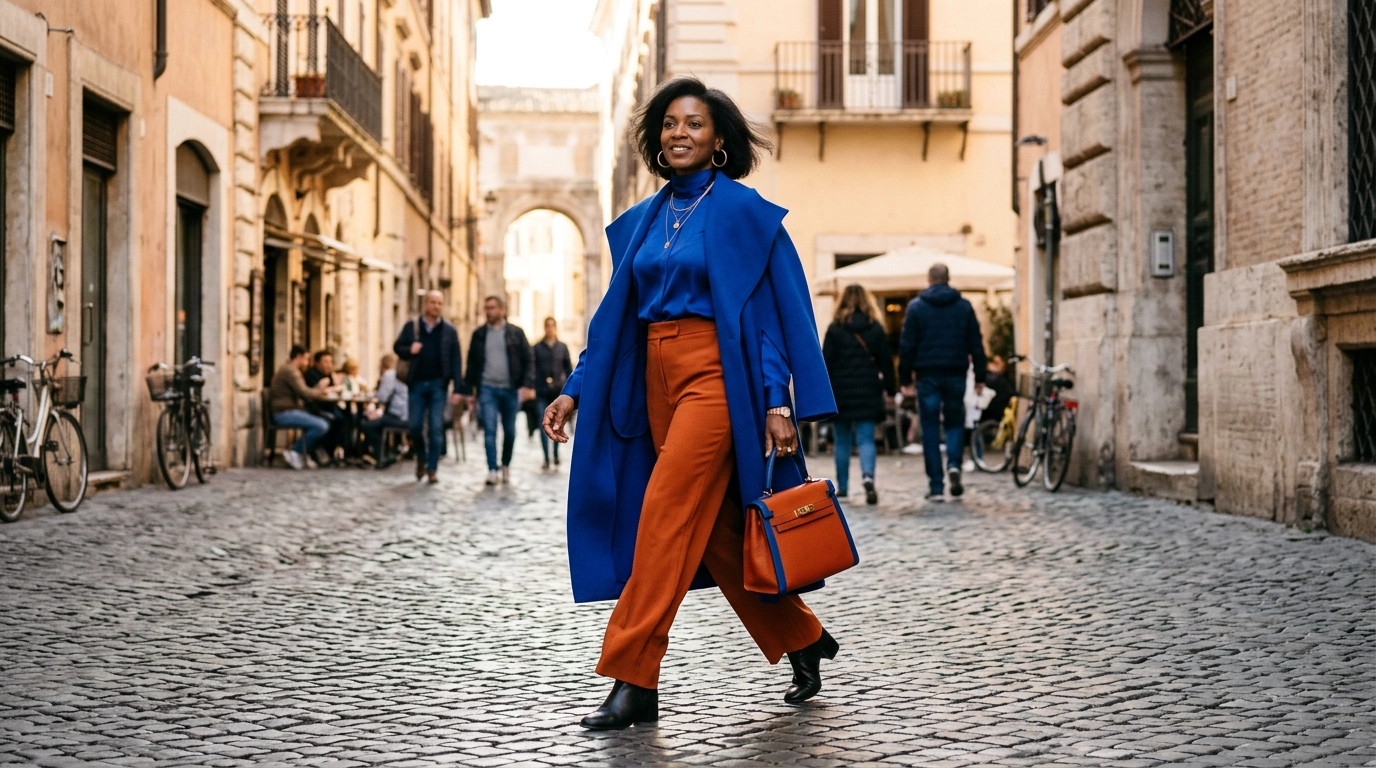
You can clash red and pink beautifully, but only if they share the same undertone. Mixing a warm, orange-based red with a cool, blue-based berry pink creates a muddy, jarring visual conflict.
Check your garments under natural light to identify if they lean “cool” (blue/silver) or “warm” (yellow/gold). Stick to one temperature across your entire outfit to maintain a sense of cohesion despite the color contrast.
When temperatures match, even the most daring combinations like orange and teal look expensive. When they don’t, the clothes look like they belong to two different people.
3. The Mismatched Black Fabric Trap
Black is not just black; it has underlying pigments of navy, brown, or charcoal. Wearing a “red-black” cotton shirt with “blue-black” synthetic trousers is a subtle color clash that makes an outfit look cheap and faded.
If you cannot match the blacks perfectly, use texture to bridge the gap. A black leather jacket over a black silk slip dress hides the pigment difference through the way light hits the varying surfaces.
Always check your “all-black” looks near a window before leaving the house. If one piece looks dusty or navy in the sun, swap it for a contrasting color instead.
4. Overloading on Neon Saturation
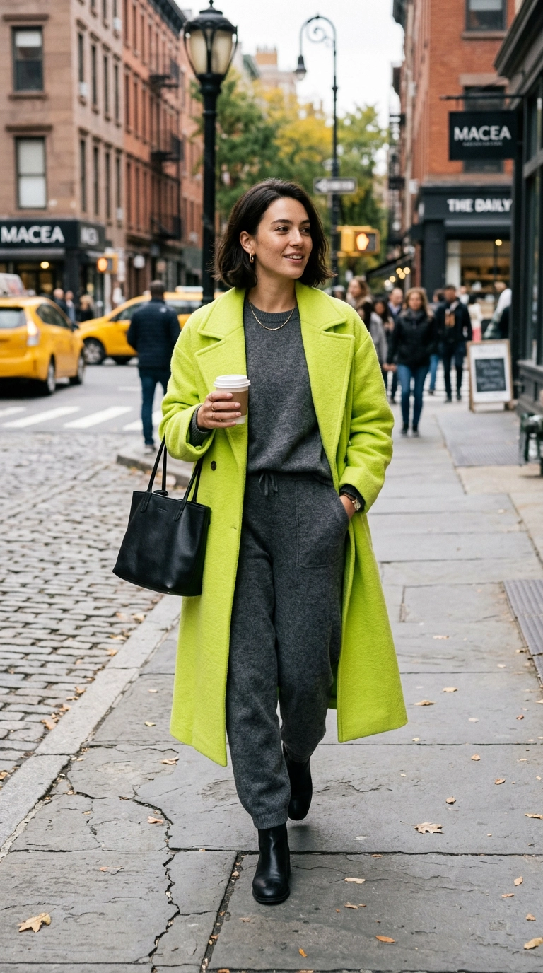
Wearing two different neon shades at full volume is a recipe for visual exhaustion. While high-fashion runways experiment with this, in daily wear, it often translates as “costume” rather than “couture.”
If you want to use neon, pair it with a deeply desaturated version of its complement. For example, pair neon orange with a very dark, muted navy rather than a bright royal blue.
This allows the neon to act as a focal point rather than fighting for dominance. Luxury style is about knowing where to place the exclamation point, not making every word a shout.
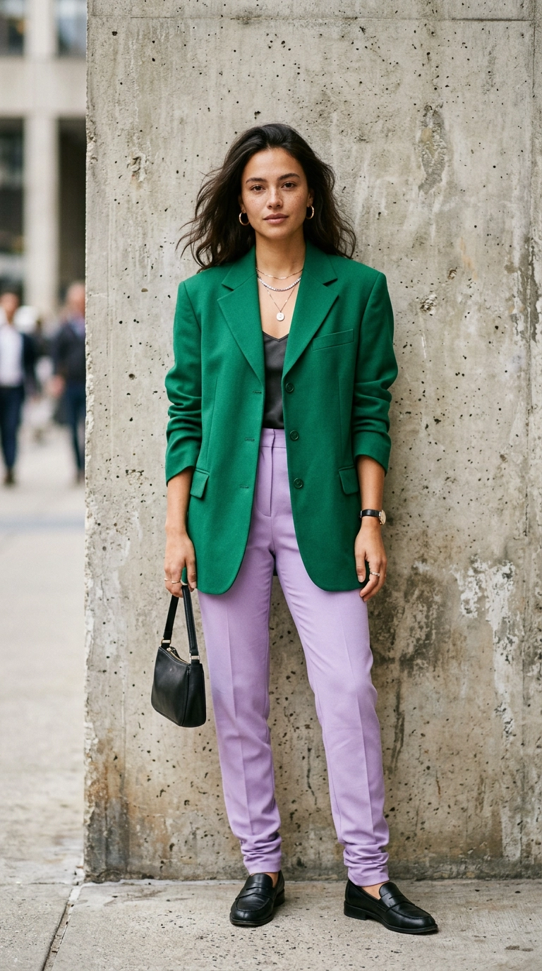
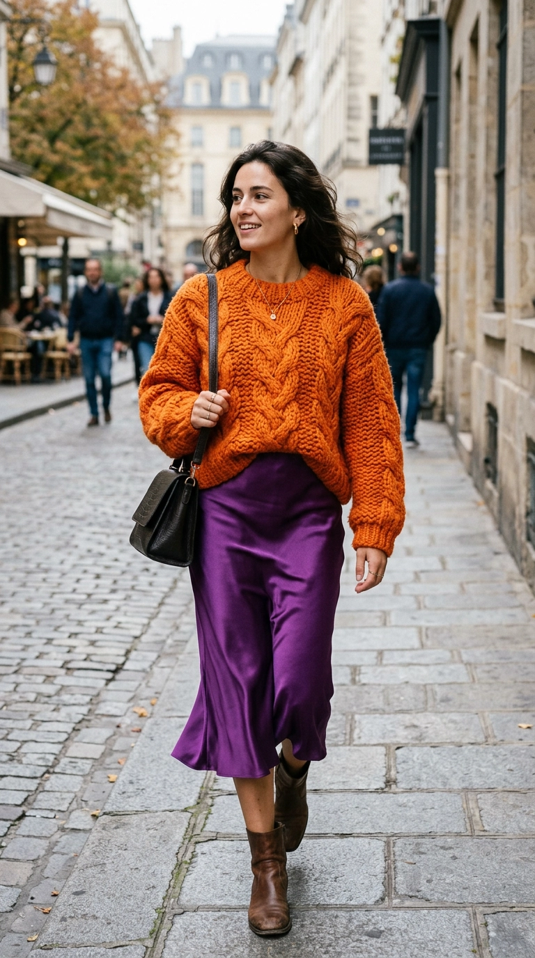
5. The Primary School Color Palette
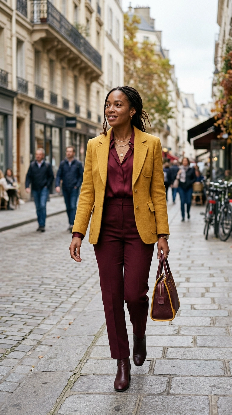
Using pure red, pure blue, and pure yellow in one outfit often mimics a child’s toy set. These high-contrast primary colors are too basic for a sophisticated, adult wardrobe when used in their purest forms.
To fix this, shift the shades slightly away from the primary wheel. Swap bright red for oxblood, sunny yellow for ochre, and royal blue for navy or slate.
These “grown-up” versions of primary colors allow for clashing that feels grounded and mature. You still get the impact of the color wheel without the juvenile connotations.
Recommended High-Contrast Pairings
| Risk Level | Primary Color | Clashing Partner | The “Pro” Adjustment |
|---|---|---|---|
| High | Bright Red | Bright Green | Burgundy and Emerald |
| High | Yellow | Purple | Mustard and Deep Plum |
| Medium | Orange | Blue | Terracotta and Midnight Blue |
6. Forgetting the Neutral Grounding
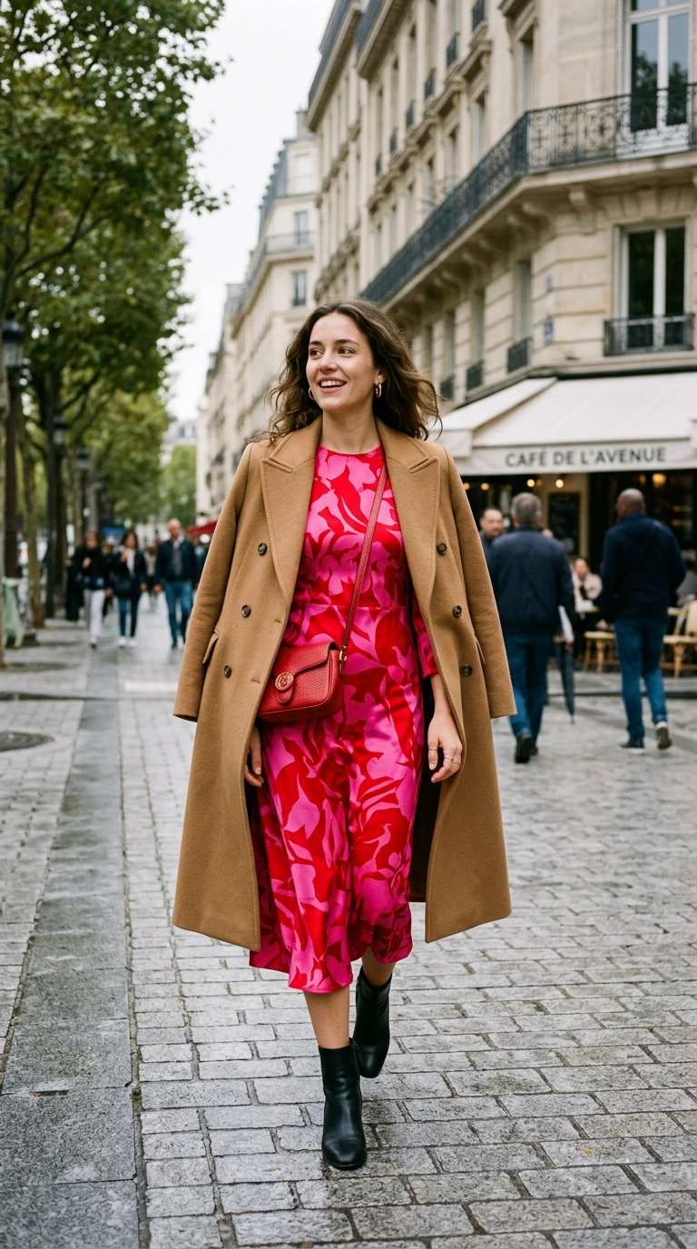
Even the most brilliant color-clashed outfits need a “palate cleanser.” Failing to include a neutral element—like a white tee, a beige coat, or black boots—makes the colors feel untethered.
Think of neutrals as the white space in a painting. They provide the eye a place to rest, which actually makes the clashing colors stand out more effectively.
A pair of crisp white sneakers or a tan leather handbag can instantly save an outfit that feels “too loud.” It signals that the color choice was a stylistic decision, not an accident.
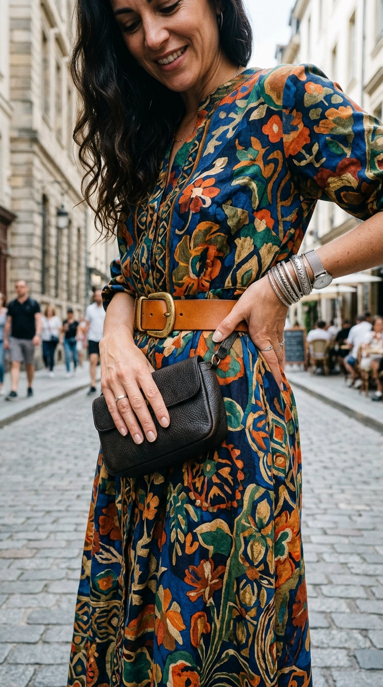
7. Clashing Textures That Mute Color
Color clashing is not just about the hue; it is about how the fabric reflects that hue. Combining two flat, matte fabrics in clashing colors can look dull and lifeless.
Mix your textures to bring the colors to life. A matte wool in burnt orange paired with a glossy satin in violet creates a multidimensional look that feels expensive.
Light interacts differently with silk, leather, and wool. Use this to your advantage to create depth in your color-blocked ensembles.
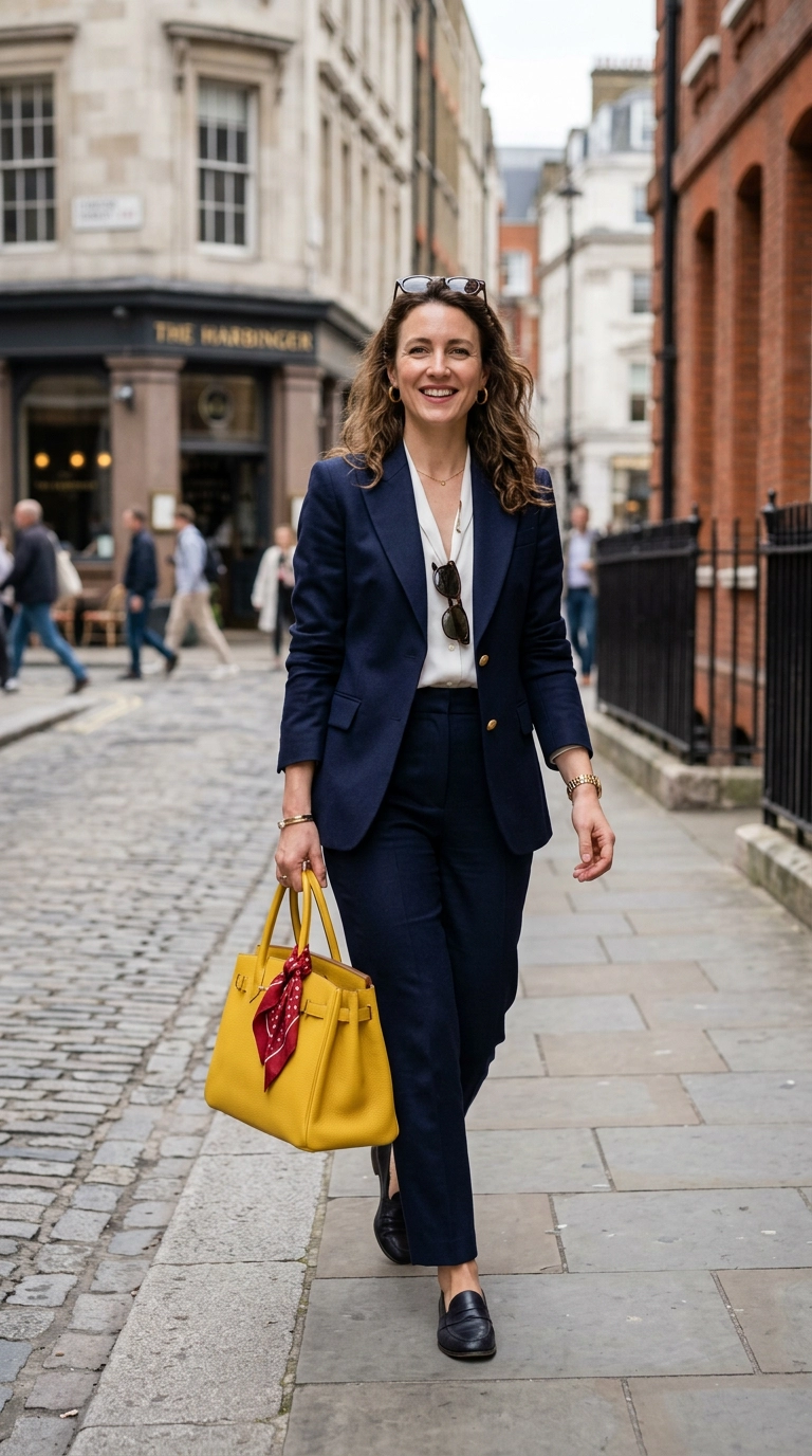
8. Metal Clashing in Hardware
If you are wearing a high-contrast outfit, adding a clash of gold and silver hardware can push the look into “messy” territory. While mixed metals are a trend, they require a very neutral base to work.
When your clothes are doing the talking with bold color clashing, keep your hardware consistent. Match your shoe buckles, handbag chains, and jewelry to one metal tone.
This provides a sense of deliberate finish. It shows you paid attention to the smallest details, which separates a fashionista from an amateur.
9. Ignoring the “Third Color” Rule
The most successful color-clashed looks often include a tiny hint of a third, unexpected color. Stopping at just two colors can sometimes feel a bit too “color-block by numbers.”
Add a small accessory—a scarf, a sock, or a piece of jewelry—in a third color that sits elsewhere on the wheel. If you are wearing green and pink, try a tiny touch of tangerine.
This “discordant note” makes the outfit feel more personalized and less like it came straight off a mannequin. It is the signature move of the world’s best-dressed women.
- Use a patterned silk scarf to introduce the third color.
- Try a bold lip color as your third “accessory.”
- Ensure the third color is less than 5% of the total visual area.
10. Mismatching Seasonal Color Weights
Color has weight. Pastels feel light and airy, while jewel tones feel heavy and grounded. Clashing a “spring” pastel with a “winter” jewel tone often creates a seasonal identity crisis.
Ensure your colors share a similar “visual weight.” If you are going for a bold clash, make sure both colors are equally vibrant or equally muted.
Pairing a dusty sage green with a deep, heavy plum can look unbalanced. Instead, pair that plum with a mustard or a rich navy to keep the “mood” of the outfit consistent.
Style Mistakes Summary Table
| The Mistake | The Result | The Fix |
|---|---|---|
| 50/50 Color Split | Cuts body in half | Use 70/30 proportion |
| Mixed Undertones | Muddy appearance | Stay all warm or all cool |
| Unanchored Brights | Visual chaos | Add a neutral “cleanser” |
| Pure Primaries | Looks juvenile | Use “muddy” or jewel versions |
Color clashing is a skill that rewards the brave but favors the disciplined. By avoiding these common pitfalls and focusing on proportion, undertone, and texture, you can transform your daily wardrobe into a high-fashion portfolio. Start with one bold pairing tomorrow and watch how your style confidence scales.